👻👻👻Tailwind - Getting Started👻👻👻
A beginner's quick-start guide on getting you hands-on immediately...

Hi, I'm Manik!Full Stack Developer (MERN/Next.js), AWS Certified, passionate about building cloud-native and AI-powered web apps.I love automating workflows, backend development, and sharing what I learn about productivity and DevOps. 🛠️ React | Next.js | Node.js | MongoDB | AWS | OpenAI | TailwindCSS | Git | Cursor AI🔗 LinkedIn | GitHub 2200+ readers on Hashnode | Open to remote and freelance opportunities.
So I am here with yet another article on the wonderful utility-first CSS framework for rapidly building custom user interfaces... 👻TailwindCSS👻
I would focus on the quickest way to get started with your TailwindCSS journey as I believe you just need to learn the basics and then it is off to production and regularly consulting with the official documentation.
🎨🎨🎨What is TailwindCSS ?🎨🎨🎨
- TailwindCSS is a front-end framework designed to shorten the code used for styling our webpages.
- You may say it is a shorthand for traditional CSS styling and is used across the world.
🤔🤔🤔Why use it anyways ?🤔🤔🤔
- In a production environment when stakes are running high, you need to be super-fast in building your projects and this is where TailwindCSS is a life-saver.
- It hugely reduces your line of code.
- It is an excellent addition to your webdev techstack.
🔨🔨🔨Installation🔨🔨🔨
- The most easiest way to get started is by using the CDN.
<!DOCTYPE html>
<html lang="en">
<head>
  <meta charset="UTF-8">
  <meta http-equiv="X-UA-Compatible" content="IE=edge">
  <meta name="viewport" content="width=device-width, initial-scale=1.0">
  <script src="https://cdn.tailwindcss.com"></script>
  <script>
    tailwind.config = {
      theme: {
        extend: {

          colors: {
            yourcolor: '#da373d',
          },

          screens: {
            'sm': '576px',
            // => @media (min-width: 576px) { ... }

            'md': '960px',
            // => @media (min-width: 960px) { ... }

            'lg': '1440px',
            // => @media (min-width: 1440px) { ... }
          },

          fontFamily: {
            'sans': ['ui-sans-serif', 'system-ui', ...],
            'serif': ['ui-serif', 'Georgia', ...],
            'mono': ['ui-monospace', 'SFMono-Regular', ...],
            'display': ['Oswald', ...],
            'body': ['"Open Sans"', ...],
          }

        }
      }
    }
  </script>
  <title>Document</title>
</head>
<body>

    <h1>This is a heading</h1>

</body>
</html>
📈📈📈Utility-First Fundamentals📈📈📈
- Please consider the below code to get a quick glance as to how TailwindCSS actually works, the kind of syntax it uses and how exactly shorthands work :
<body>

    <div class="flex flex-col justify-center items-center h-[100vh]">
      <h1 class="font-bold text-[2em] text-red-500">This is a heading</h1>
      <img class="h-[20em] mt-[1em] mb-[2em]" src="./pexels-pavlo-luchkovski-337909.jpg" alt="">
      <button class="text-[1.2em] font-bold px-[2em] py-[0.5em] bg-gray-500 rounded-[5em]">Click Here</button>
    </div>

</body>
After going through the code above, please compare how traditional CSS uses these components :
- flex :
.sampleClass{
    display: flex;
}
- flex flex-col justify-center items-center h-[100vh] :
/* flex flex-col justify-center items-center h-[100vh] */

.sampleClass{
    display: flex;
    flex-direction: column;
    justify-content: center;
    align-items: center;
    height: 100vh;
}
- font-bold text-[2em] text-red-500 :
/* font-bold text-[2em] text-red-500 */

.sampleClass{
    font-weight: bold;
    font-size: 2em;
    color: red;
}
- h-[20em] mt-[1em] mb-[2em] :
/* h-[20em] mt-[1em] mb-[2em] */

.sampleClass{
    height: 20em;
    margin-top: 1em;
    margin-bottom: 2em;
}
- text-[1.2em] font-bold px-[2em] py-[0.5em] bg-gray-500 rounded-[5em] :
/* text-[1.2em] font-bold px-[2em] py-[0.5em] bg-gray-500 rounded-[5em] */

.sampleClass{
    font-size: 1.2em;
    font-weight: bold;
    padding: 0.5em 2em;
    background-color: gray;
    border-radius: 5em;
}
This approach allows us to implement a completely custom component design without writing a single line of custom CSS.
You do not waste time thinking what class names should you give.
Code length is greatly reduced.
Editing or debugging the code is simpler.
🦅🦅🦅Handling states like Hover and Focus🦅🦅🦅
- Tailwind has modifiers for everything which traditional CSS has to offer.
Few examples are given below:
- :hover
In the below example, this changes text-color of button to red whenever the mouse is hovered over it.
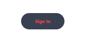
<button class="px-[3em] py-[1em] bg-gray-700 rounded-[2em] text-white font-bold hover:text-red-500">Sign In</button>
- :focus
In the below example, this creates a outline ring of color violet whenever focus is given on the button.
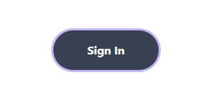
<button class="px-[3em] py-[1em] bg-gray-700 rounded-[2em] text-white font-bold hover:text-red-500 focus:outline-none focus:ring focus:ring-violet-300">Sign In</button>
📷📷📷Responsive Design📷📷📷
- Please note that Tailwind uses a mobile-first design approach.
Tailwind promotes building a design first for mobile and then build up progressively to larger screens.
There are five breakpoints by default, inspired by common device resolutions:
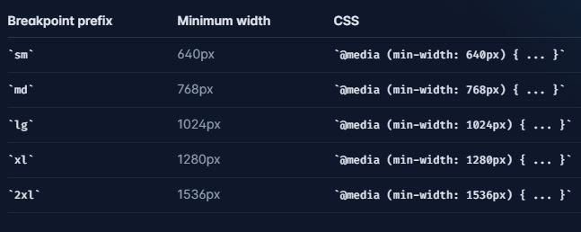
In the below example, the font-size for h1 element would be assigned as 1em for width 640px and above, 2em for width 768px and above, 3em for width 1024px and above.
<h1 class="sm:text-[1em] md:text-[2em] lg:text-[3em]">This is a heading</h1>
- You can completely customize your breakpoints in your tailwind.config script section using your own custom defined breakpoint names and sizes.
<script>
    tailwind.config = {
      theme: {
        extend: {

          screens: {
            'small': '350px',
            // => @media (min-width: 350px) { ... }

            'medium': '800px',
            // => @media (min-width: 800px) { ... }

            'large': '1200px',
            // => @media (min-width: 1200px) { ... }
          },

        }
      }
    }
  </script>
💾💾💾Customizing your Tailwind💾💾💾
- You may override the Tailwind pre-defined configurations by editing the tailwind.config script section.
In the below example custom screen sizes, custom colors and font-families are given as you may desire.
<script>
    tailwind.config = {
      theme: {
        extend: {

          colors: {
            mycolor1: '#da373d',
            mycolor2: '#dd383d',
            mycolor3: '#dd322d',
            mycolor4: '#ed333d',
          },

          screens: {
            'small': '350px',
            // => @media (min-width: 350px) { ... }

            'medium': '800px',
            // => @media (min-width: 800px) { ... }

            'large': '1200px',
            // => @media (min-width: 1200px) { ... }
          },

          fontFamily: {
            'sans': ['ui-sans-serif', 'system-ui'],
            'serif': ['ui-serif', 'Georgia'],
            'mono': ['ui-monospace', 'SFMono-Regular'],
            'display': ['Oswald'],
            'body': ['"Open Sans"'],
          }

        }
      }
    }
  </script>
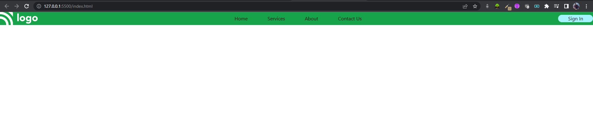
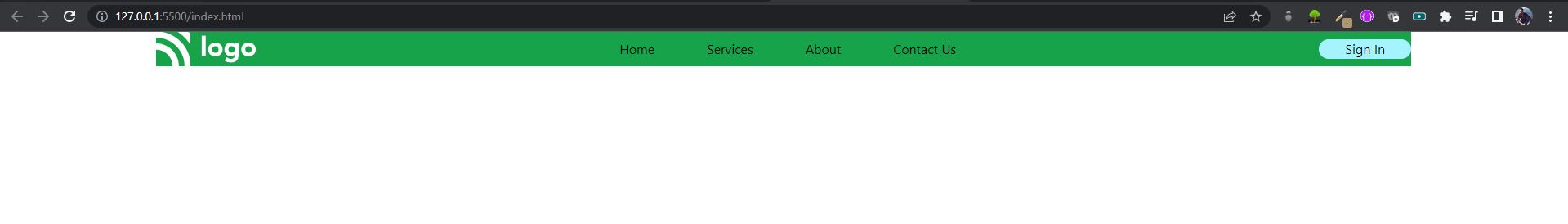
🍱🍱🍱Container🍱🍱🍱
- A component for fixing an element's width to the current breakpoint.
- This is particularly useful if you want to keep left and right margins in check and keep the whole webpage aligned in the center.
- The container class sets the max-width of an element to match the min-width of the current breakpoint.
- Tailwind’s container does not center itself automatically and does not have any built-in horizontal padding.
In the below example, check the navbar without the container class and then after the container class :
<body>

    <nav class="bg-green-600 flex justify-between items-center">

      <img src="./Logo.png" alt="">
      <ul class="flex justify-center items-center">
        <li class="mx-[2em]">Home</li>
        <li class="mx-[2em]">Services</li>
        <li class="mx-[2em]">About</li>
        <li class="mx-[2em]">Contact Us</li>
      </ul>
      <button class="bg-cyan-200 px-[2em] py[0.5em] rounded-[5em]">Sign In</button>

    </nav>

</body>
<body>

    <nav class="container mx-auto bg-green-600 flex justify-between items-center">

      <img src="./Logo.png" alt="">
      <ul class="flex justify-center items-center">
        <li class="mx-[2em]">Home</li>
        <li class="mx-[2em]">Services</li>
        <li class="mx-[2em]">About</li>
        <li class="mx-[2em]">Contact Us</li>
      </ul>
      <button class="bg-cyan-200 px-[2em] py[0.5em] rounded-[5em]">Sign In</button>

    </nav>

</body>


